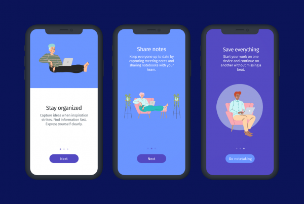
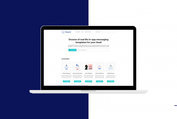
When it comes to announcing important news, the best channel you have in your hands is your website or product.
How do you communicate with your users when there’s a new product, server update, or a discount campaign? Do you send newsletters and share posts on social media to reach out to your audience?
What if I tell you that emails and social media posts will most likely pass unnoticed? And that you will still receive questions from customers?
When it comes to engaging users and announcing news, the best channel you have is your website or product. Because that’s where your users will be. In this article, we talk about in-app messaging and share some examples of in-app messages you can use.
So, what is in-app messaging?
In-app messaging is a marketing tool used to improve user engagement and retention. Based on user behavior, in-app messages allow you to interact with your users faster.
Products that use in-app messaging during the first onboarding week can increase customer retention by 130%. Proving to be an effective marketing strategy.
In-app messages are contextual and presented to users when they are using your app or website. Unlike push notifications, in-app messages are less intrusive and always delivered to users. Without requiring any special permission.
In-app messaging examples
There are many types of in-app messages you can use. From onboarding tours to special announcements. Here are some of the most common examples.
1. Onboarding Messages
Used to introduce your product or service after users log in or enter a specific area for the first time.
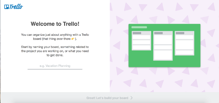
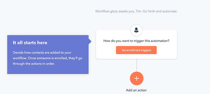
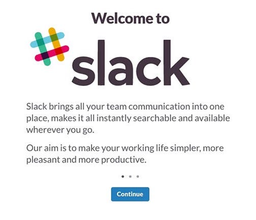
The first time using a service can be scary and confusing. By delivering onboarding messages such as product tours or welcome popups, you engage with your users right from the first moment. And reduce any possible frustration.
Product tours and walkthroughs are often used to highlight the main features/products, and explain how to get started.
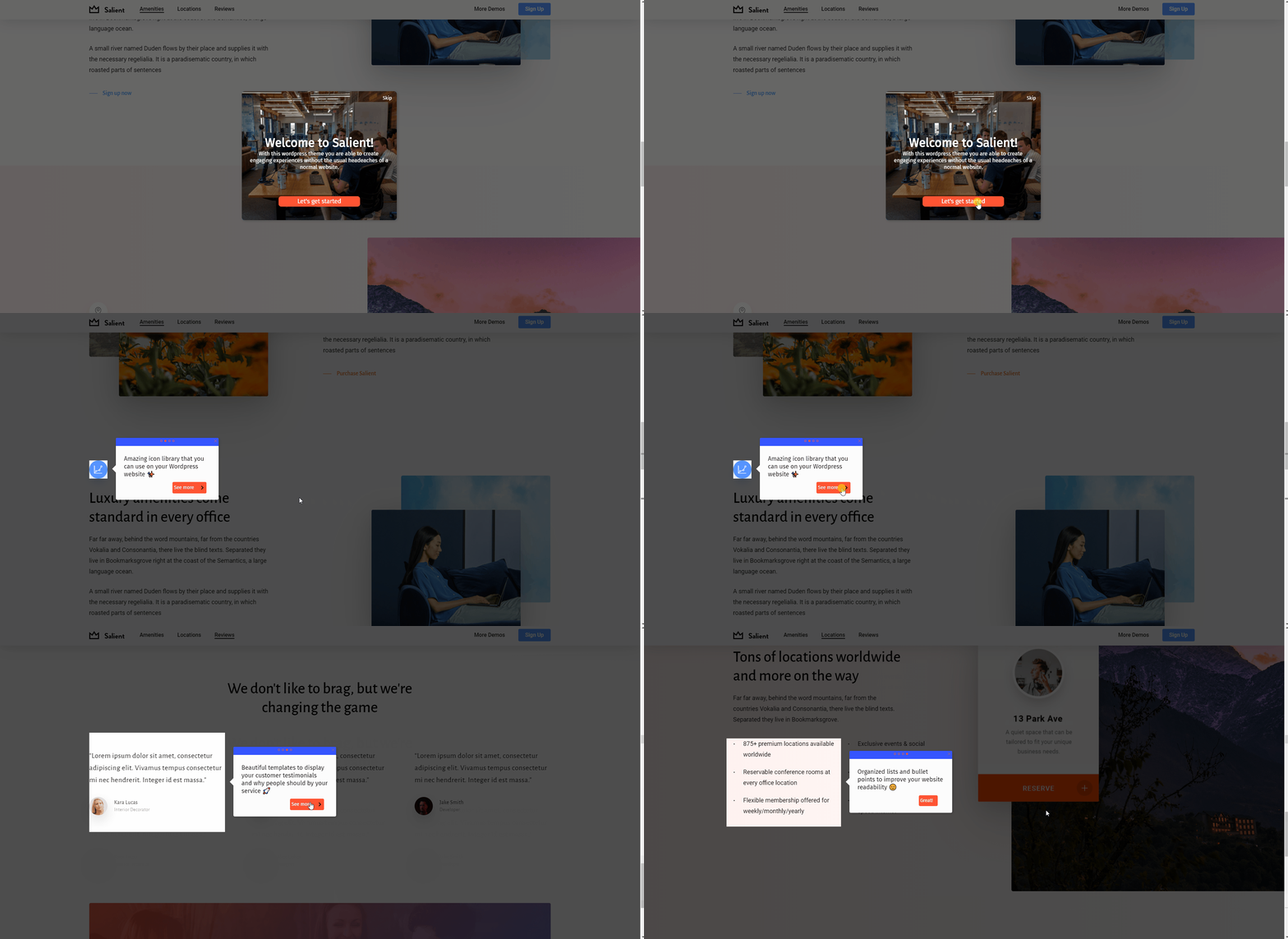
Welcome popups are not only appealing but can also include a specific video or resource that you want users to read before getting started.
So, in addition to your usual welcome email, trigger beautiful onboarding messages directly on your website or app to make sure new users have the best experience possible.
Examples from top companies
Trello
Hubspot
Slack
2. Discount Messages
Used to improve conversions. You can promote coupons, discounts, or even provide freebies to your users.
If you really want to convince users to become long-term customers, a strategy you can use is to present discount campaigns on a specific area of your app or website.
There are many ways you can present discounts and, with Helppier, you can fully customize your messages and place them at any position on the page.
Banners are a great way to catch your user’s attention as they are large and take some space on your page. Place a banner with an appealing call to action on the bottom of your page for better results.
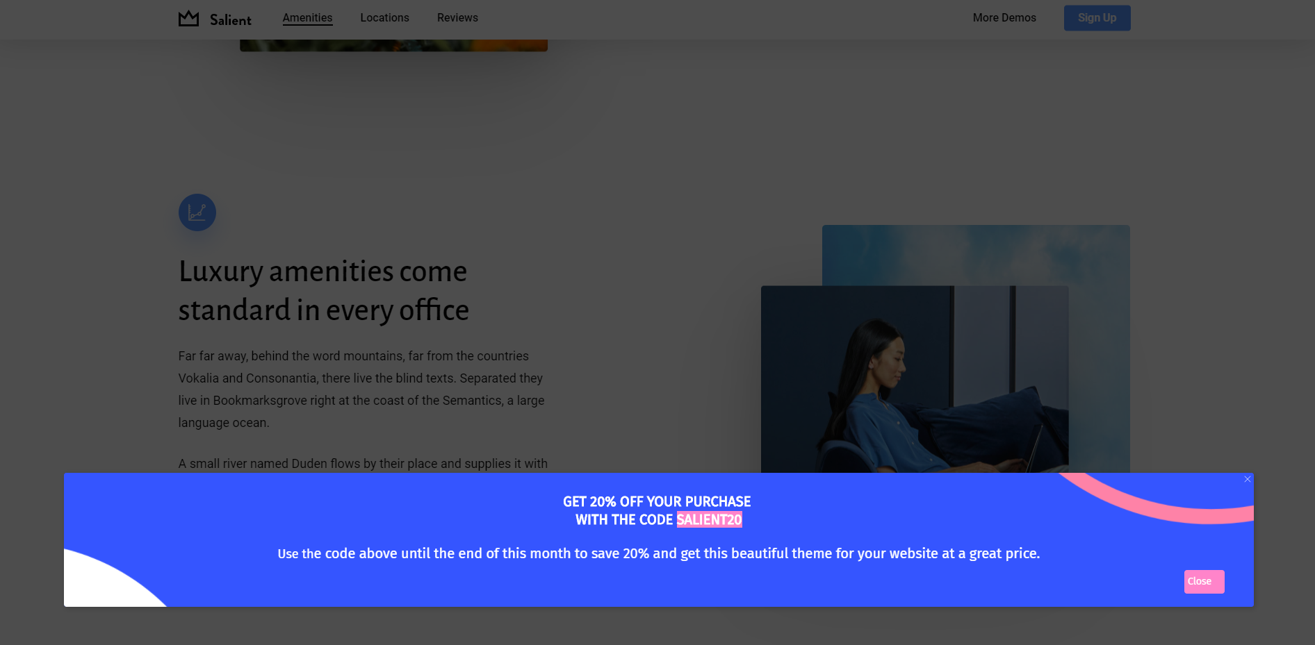
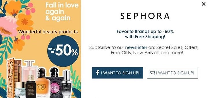
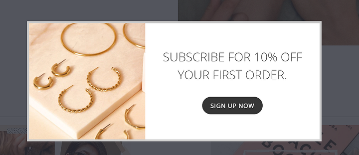
Popups are very common and effective as they appear for the user at a specific time, place, and usually, at the center of the page. Use beautiful images and compelling copy to get users to use your discount code and make sure you’re not showing several popups at the same time.
Examples from top companies
Sephora
Orelia
3. Feature Announcements
Used to inform about new updates, products, or features and explain new options on your website or app.
Product and feature adoption can be a challenge.
Most of the time, customers won’t use all of your features and services. But if you want to highlight specific areas and entice them to give it a try, you can always try feature announcements.
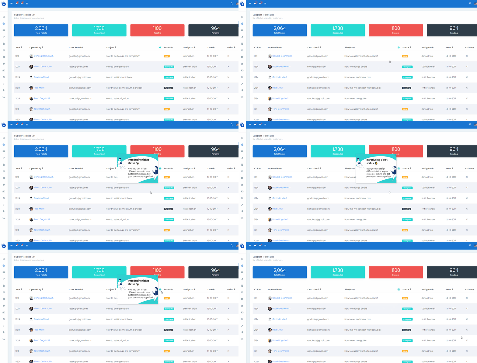
Popups are a common way to inform new updates or promote specific options/products.
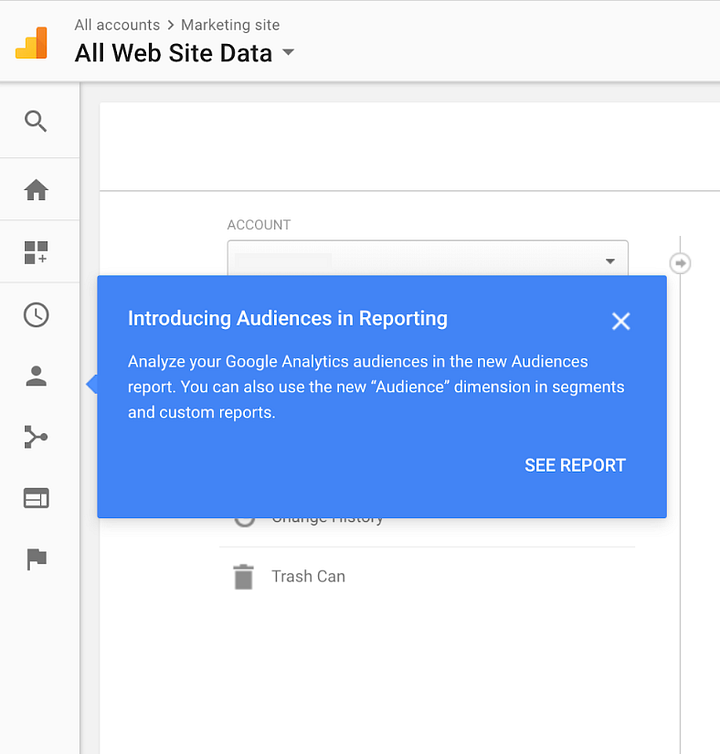
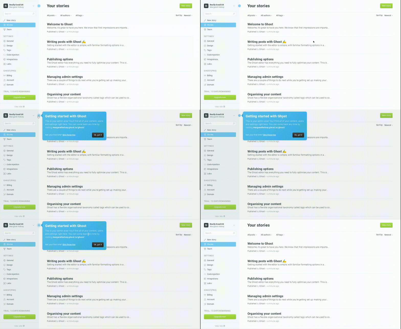
Tooltips and Hotspots are another effective way and less intrusive than popups. You can place near the area you want to promote to catch the user’s attention. Once users click on it, they can access more information. You can also use hotspots inside images.
Examples from top companies
Google Analytics
Ghost
4. Warnings & Notifications
Used to notify about important changes. For example, server updates, errors, new policies, or business hours.
The main difference between warnings and notifications is urgency.
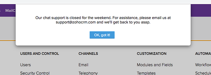
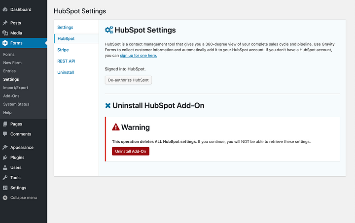
You should use warnings for important information such as server updates, maintenance, errors, etc. Opt for colors such as orange, red, and yellow to provide this type of message. You should also use warnings in advanced areas that require more technical knowledge.
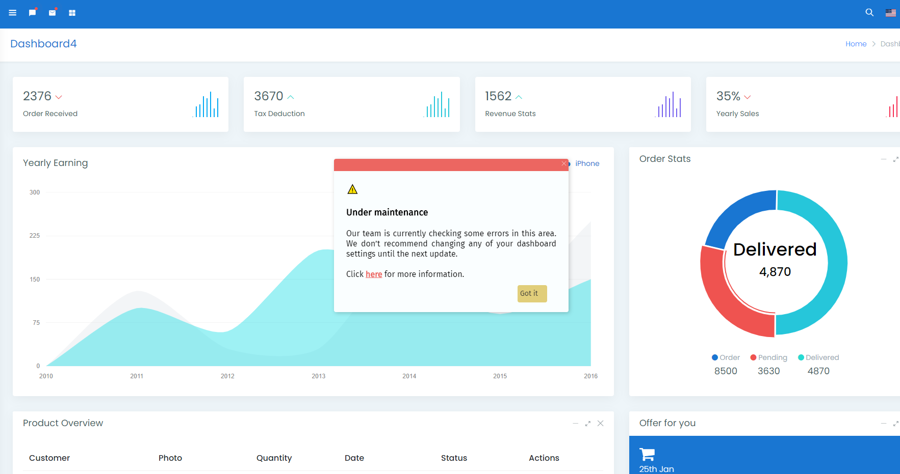
When it comes to notifications, you should use them to inform users about new policies, business hours, a new version of your product, etc. The most common colors to use are blue, green, white, and grey.
Examples from top companies
Zoho
Hubspot (WordPress Plugin)
5. Transactional Messages
Used after a specific action on your website or app, for example, a sale or registration.
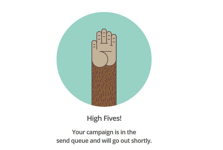
Present success messages after users register for your newsletter, purchase products, provide feedback, or complete a form on your website. This allows a positive experience and provides an idea of completion.
Besides, you can present product recommendations after the user purchases a product or adds an item to the cart. This practice will allow you to improve conversions and retain customers.
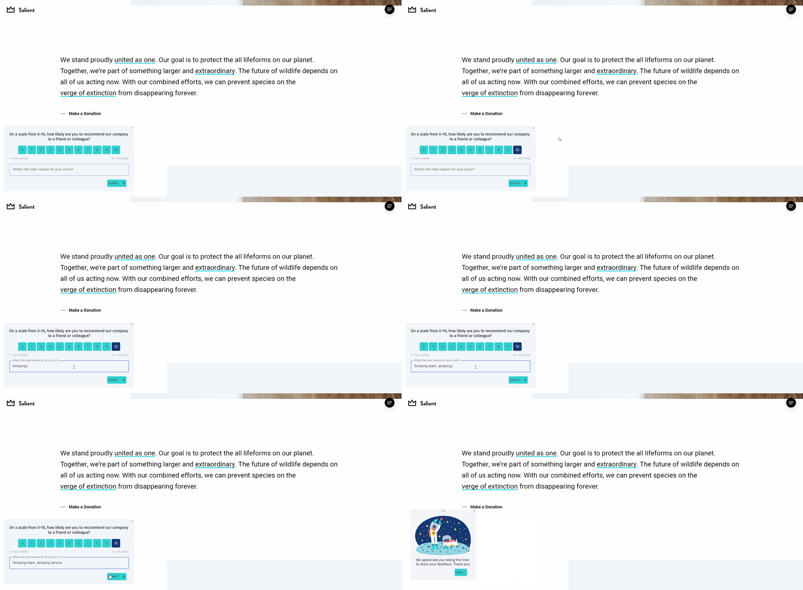
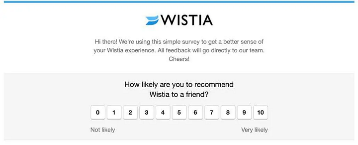
NPS is the best and quickest tool to get feedback from users after they try a feature for the first time or complete a long process. By presenting NPS surveys, you can make improvements based on real customer feedback.
Examples from top companies
Mailchimp
Wistia
How to create in-app messages for my website or web application?
Usually, you need a full development and design team to create beautiful in-app messages for your app or website. But, using in-app messaging tools like Helppier, you can create and publish without any technical knowledge.
Here’s how simple our builder is:
We offer powerful customization tools and integration with Canva so you can create engaging warnings, banners, popups, onboarding tours, and more. Without any help from your designers.
Sounds good? Try it out for free. 😉


