Convince users even when they hesitate for a split-second.
When most of our daily interactions are made through taps and swipes, it’s no surprise that 50% of millennial consumers prefer to make purchases online. Besides, 77% of adults in the UK make it a lifestyle as well, having bought goods and services on online platforms last year.
In fact, the online software business is becoming to look like a grocery store. Customers are so overloaded with new products and brands, that they are not sure what to get first. And although 38% of buyers will leave due to unattractive design, positive user experience is still one of the main reasons for conversions.
“A well-designed user interface could raise your website’s conversion rate by up to a 200%, and a better UX design could yield conversion rates up to 400%.” — FORBES
Building a successful online business means ensuring positive emotions in the user. This can be achieved by an intuitive interface that together with a powerful UX design, is able to showcase what your service does and why it’s useful for the user.
When talking about user experience, we need to think about first-time users. How these poor beings who have never visited your website or used your products before, will understand how it works? And even buy it?
So, if you want to increase sales this year you should definitely try these strategies down below.
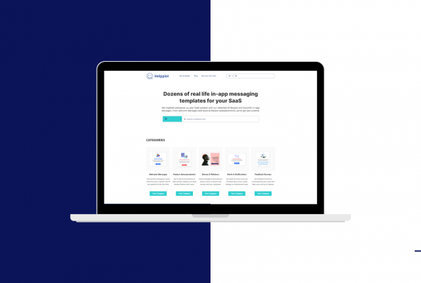
Get more engagement through In-app messages

Usually, when a user signs up for a specific software or product, companies immediately target them with a beautiful welcome email. Which is supposed to boost engagement or even get users to schedule a private demo.
And although that’s a very good idea, in most cases, users don’t get to open that email or even reply. So, if you really want to catch their attention and get them to engage with your team, include in-app personalized messages.
This is far more effective because these messages will be targeted to users while they are using your service. This way you trigger more interest and fasten response time as customers don’t have to move to another page.
Build a personalized website experience

User experience is about surprising the customer. And placing them at the center. Make them laugh with a funny personalized message or showcase products based on their personal interests.
Get advantage of data points such as location, social behavior and search queries to provide a personalized website experience and introduce special promotions or merchandising for users.
We all love to feel special, and your users will definitely appreciate that.
Create videos about your service

A great way to retain users is by creating videos about your service. Take advantage of this type of content to improve your website’s overall experience and introduce your value faster.
Video helps persuade 73% of people to make a purchase!!! Introduce corporate or animated videos on your Facebook page, create a YouTube channel with tutorials and inspirations, or add it to your web design.
Did you also know 46% of users claim that a “lack of message” will cause them to leave? And what better way to share information than through video?
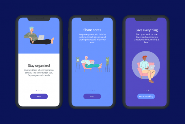
Introduce value through onboarding walkthroughs
Research shows that 54% of potential clients want to see how the product works on a first call. User experience is about reducing frustration! If you want to increase sales and conversions, you need to clarify, right from the moment they enter your website, what you’re offering. And why it’s better than the competition.
Whether you have a complex software or an e-commerce website, you need to make sure users know how to use your platform. By introducing onboarding walkthroughs, they can follow the right path and interact with your website at the same time.
This way, users will understand the full value of your service and manage to complete tasks more easily. Just make sure to break it down into small steps, so it’s not overwhelming.
Give more meaning to your CTAS


A positive UX is about finding important things and achieving goals quickly. And that’s precisely why CTAs exist. They work like small road signs that lead the way to important things on your website.
For that reason, you will need to set your end goal. Maybe you want them to sign up or create an account. Maybe you want them to download your new catalog. Or even schedule a demo. Whatever that is, it definitely shouldn’t be picked at random.
Take notice of your users’ behavior. Maybe users who invite friends are more likely to return? Try to find out common traits among active users, and create a website experience that triggers such behaviors. And use your CTA’s wisely.


