Here are some ways you can transform your FAQ page into actually appealing and helpful information for users.
In any business, it’s only natural for customers to have questions. But just like you and I, customers don’t really like waiting for a phone call or email to get things done. 😅 A survey of 1.044 US consumers conducted by Zendesk shows that 48% of Millennials are more likely to look for ways to solve problems on their own. That’s where FAQs come in. In fact, the research states that 98% of respondents have used an FAQ, help center, or other self-service resources.
To troubleshoot and answer possible questions, most companies do opt to create an FAQ page inside their website, and, if they run offline (e.g. furniture companies & home technology), offer printed manuals with step-by-step instructions. The issue with this traditional answer-question format is that, among several other reasons, it is extremely long and users often don’t read it.
In a previous article, I mentioned an award-winning paper called Life Is Too Short to RTFM which states that only 25% of the time people read the manuals! 😮 Not only that but the research also found that even when people did read manuals, they become frustrated and found them ineffective.
So how do you transform your boring FAQs into actually appealing and useful information? 🤔
Use videos, videos, and more videos

In online business, video is king. According to a Wyzowl survey, if users have to choose between text and video on the same page, 72% will opt to use video to learn about a product or service!
A great way to step up your FAQ page is to include tutorial videos. Videos allow reducing the learning curve for users and help them achieve their goals faster, without having to contact your support team. I recently wrote about the use of tutorial videos for customer support and found that video not only reduces frustration and improves user productivity, but also increases engagement on a webpage by up to 80%. ✨
Start by identifying the most viewed article inside your FAQ page, and take advantage of its existing content as a base to create a short tutorial video of a specific feature or process. Tools like Helppier allow you to quickly record step-by-step tutorials on top of your website and export the video file. Super simple.
Use chatbots to send FAQ links automatically

Chatbots are increasingly popular and for a good reason. They help users connect with customer service in a much faster and effective way than email or phone calls. A research conducted by Drift states that 56% of people would rather message than call support.
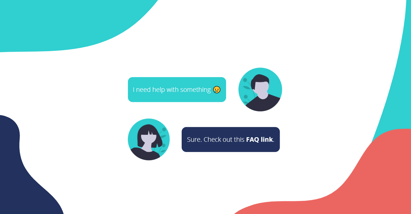
Chatbots are very powerful. 💪 They allow automating common questions and easily define a message flow. You can integrate your FAQ page or Knowledge Base so the bot shares a link when a specific keyword or subject comes up. This is much more appealing than having to go through your FAQ page. According to Drift, integrating chatbots can help reduce costs by 30%.
Other tools in the market include Acquire and Crisp. Personally, I have tried Crisp and thought their automation process was very intuitive, I definitely recommend checking out.
Connect your FAQs with interactive help centers

One of the main issues with FAQs is that users need to leave the page they’re in to access information. And have you tried following instructions while changing tabs? Extremely frustrating. 😠
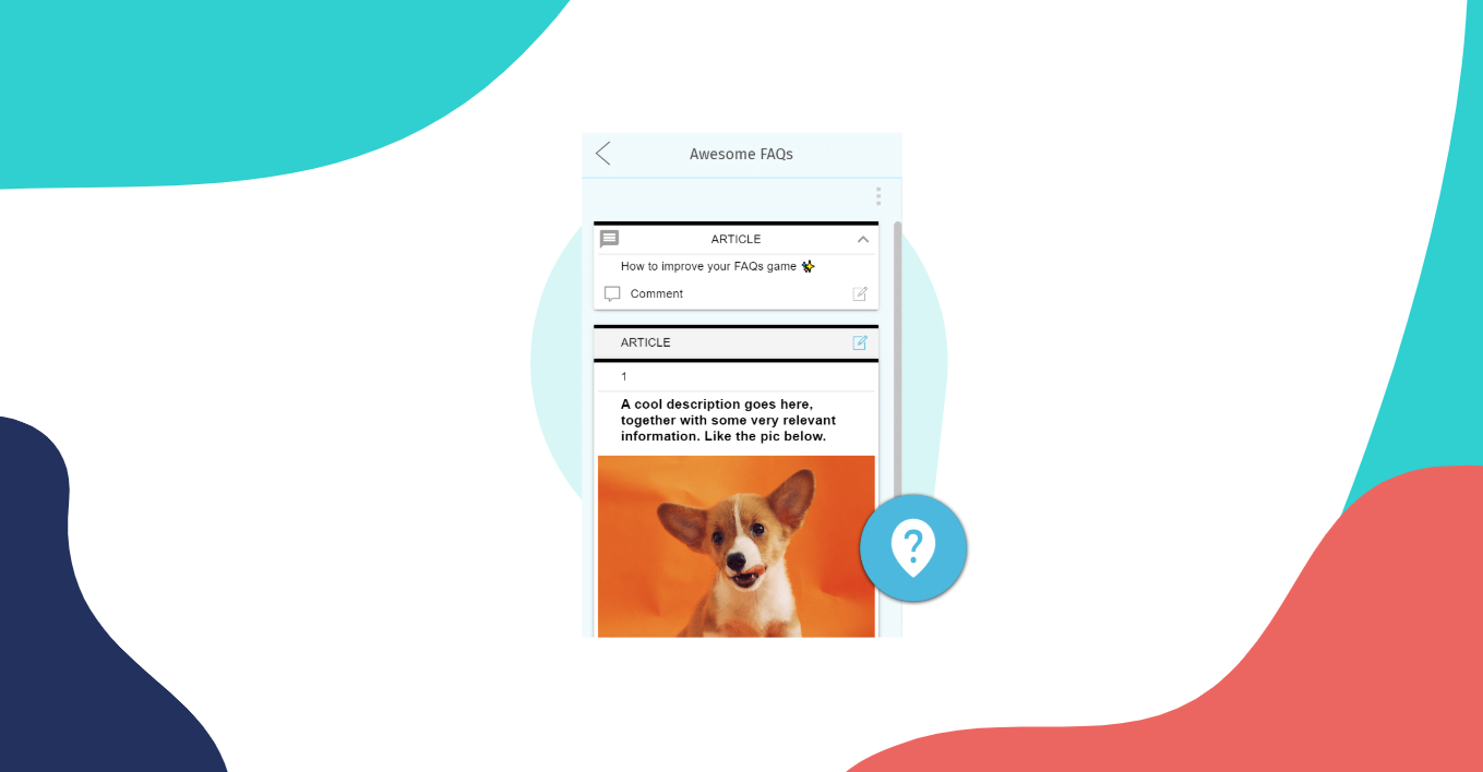
You often find interactive help centers in software and e-commerce websites. These tools are often located in the right bottom corner of the page, with beautiful interactions and UI that makes you want to click on it. If you want to improve the overall user experience, integrate your FAQ page with this type of tools, so users can access your help articles without having to stop what they’re doing on your website.
With Helppier, for example, you can integrate your FAQ page link with a simple copy and paste. If you’re already using a Knowledge Base system like Zendesk, you can also integrate your account, and, last but not least, you can create your own FAQs from scratch. The best thing is: all your content will be centralized and one click away from users. Goodbye tabs 👋
Create useful images and illustrations

Who else just goes through all images and headings when reading an FAQ? ✋
Just like video, images take an important role in helping the user visualize what they need to do. If your FAQs are composed of anything but text, it’s definitely time to change that.
It’s obvious why you need to include images on your FAQ page, but if you don’t have time to screenshot every single step, you can, for example, create a short illustration with a resume of the step-by-step process. Besides, it will be easier for the user to follow instructions. And if your design team is busy, there are several online tools you can use, two of them include Canva and Piktochart.
Provide in-app product tours & tooltips
In the paper I mentioned above, they explain how users prefer to go straight to using an application without reading manuals. Taking this into consideration, another great way to bring your FAQs to life is recreating them into contextual tours and tooltips. 💡
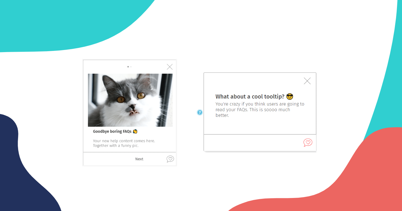
While FAQs are long and difficult to read, product tours and tooltips allow you to provide small chunks of information to the user, highlighting specifically where they need to go while browsing your website. But, although they look similar, these user guides have a few differences.
Product tours, walkthroughs or tutorials are interactive messages that guide the user step-by-step through a specific workflow. Use it to help users get started on your platform, or explain how to complete specific tasks like creating an account or changing subscription. Tooltips, on the other hand, are contextual messages that appear next to a specific element on a page (button, form field, text, etc.). Use it, for example, in form fields to explain why you’re requiring personal information or how users can find the membership number on their account.
Both are pretty useful.
In Conclusion
Quoting Lisa Wright on A List a Part: “ like zombies in a horror film, and with the same level of intellectual rigor, FAQs continue to pop up all over the web.”
But they don’t necessarily have to be boring or painful.
Including tutorial videos, interactive product tours and chatbots will accelerate user productivity and reduce frustration. In the long run, you even reduce the number of support tickets and cut down documentation development costs. 💰 Which is always good for the business.
Hope you enjoyed these suggestions and are able to increase user autonomy. Also, if you’re interested in reading more about customer support make sure to follow Helppier on Facebook and Twitter to get updated on our latest news. 📣


