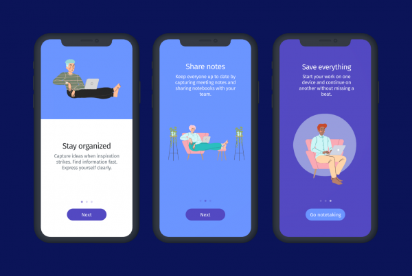
Mobile engagement is a must when around 80% of the world population have a smartphone
Here at Helppier, we are about to release a new customer experience product for mobile engagement (and we are really excited about that), so we decided to talk with a few specialists from this area to identify the best mobile engagement practices in the market. After finding out very nice opinions, we decided to share this unique content with you.
According to Statista, there are over 6.3 billion smartphone users globally, representing that around 80% of the world population has access to this technology. And here we have the main point of this text. Can you guess what am I talking about? 🤔
Outstanding products aren’t enough anymore
With around 80% of the world population using smartphones, 218 billion app downloads in 2020, users getting pickier and pickier, and your competitor being just one click (or one app 😅) away from you, this is the time to engage and loyalize users in your app.
Having unique products with amazing features isn’t enough anymore. The secret now is creating emotional connections with your users. You need to go a step further and show them that you understand and care about their needs, interests, and pains. Users are waiting for this from you. They are waiting for help at an opportune moment, waiting for interaction, and they want a memorable experience every time they interact with you.
During our interviews, we found an amazing example of it. Vinícius, Product Manager at Guru (a trading app focused on the UX), explained that the primary pain found out before creating Guru was that there were outstanding products in the market. Still, none of them were worried about the user journey. New generations didn’t identify themselves with the solutions on the market by that time because none were concerned about engaging with them.
With that said, we can affirm that this is the perfect time to invest in mobile engagement tools and strategies for your app, or… do you remember? Your competitor is right by your side!
Our brief research with mobile specialists
We have talked with 7 specialists based in Brasil and asked questions related to mobile engagement, user onboarding, support, and feedback.
We take this opportunity to thanks: Alan Kadri, Director at AppGás; Antonio Nakad, Head of Product at NG.Cash; Camila Leal, Product Manager at GeekHunter; Luiz Nodin, CEO at Inside the Box; Sílvio Crespo, Chief Marketing Office at Grana.Capital; Vinícius Miranda, Head of Product at Guru and Wildes Lima, Sócio-fundador da Wibiz.
Here we share the main point found out during these excellent talks:
User Onboarding
First things first, the first step when users download an app: the onboarding. This was pointed by many as the most crucial part of engaging users. But, unfortunately, studies show us that 25% of users abandon an app after only using it once, and the main reason for it is not focusing on great onboarding strategies.
Think about it: when you download a new app, what do you expect? Understanding how that application works and its main features the first time you open it, right? Everyone hopes that once this is the first contact between the user and the brand, but many apps don’t deliver it.
Now we come to our main question here: how is the best way to onboard users in my app?
Welcome screenshots in application stores
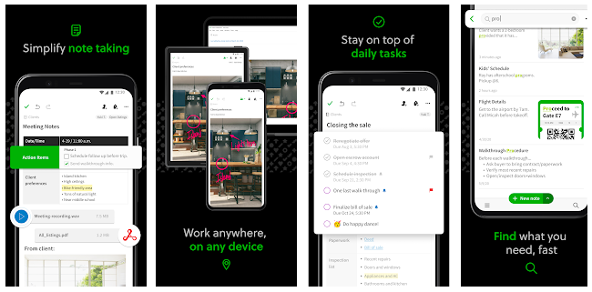
Before users download your app, presenting welcome screenshots in application stores was pointed as an important practice. This is an excellent way to “pre-present” your services to potential users and convince them to download your app. A perfect example of this is Evernote. As shown below, at Google Play Store, they present screenshots explaining briefly how the app works and its primary value, giving the users the vision of what they can expect.
Welcome screens and small tours
After convincing the user to download your app, we finally arrive at onboarding the user inside your application. Talking with the specialists, presenting welcome screens, and small tours when the user opens the app were the most mentioned practice. Antônio Nakad explained that, at NG.Cash, they have tested different methods of welcoming users, and the one that resulted better was presenting a few welcome screens, with a progress bar to show the user how many steps are left. Luiz Nodin explained that, at Inside the Box, they present 3 welcome screens to explain everything users might need to start using the app.
In addition, Camila Leal presented her experience that welcome screens must have a skip button. Moreover, she shared that, in this step, companies might predict what users need and make the path as shorter as possible (an opinion shared by almost everyone interviewed).
Sign-up moment
Finally, it’s in the onboarding phase that users usually need to sign-up. This might be the most critical moment for the user to abandon the application. Thinking about that, Alan Kadri explained that at AppGás, they first present 3 welcome screens which give the overview and demonstrate the value of the app. Only after that, they ask for creating an account (and with little data required because, because as he said, users don’t like giving too much information). Sílvio and Vinícius shared the same opinion, and they said that it’s great to let the user test your app before signing up. Specifically, at Guru, Vinicius explained that they even let the user personalize all the app before asking for much data. When they are already involved with the platform, it’s harder to abandon it.
Engagement
When users are already using your app, keeping them engaged can be a big challenge, generating high churn rates. Frequently, companies develop new unique features to their apps, but a small number of users start using and engaging with that feature.
These were our central topics when talking with our selected specialists, and we tried to understand the best way to avoid these challenges.
Before thinking about actions, they said we need to think about the mobile engagement strategy. And this strategy just can be created based on data. Alan, from Appgás, and Vinícius, from Guru, explained that they have an Analytics Team only measuring the user journey and generating data to create engagement strategies. Camila Leal added that we need to look to the user journey data to understand our users and, based on that, define pages that generate high value, and focus our strategies on these pages.
With our strategy defined, now it’s time to start engaging. The 3 top actions mentioned to engage users in mobile were:
In-app messaging:
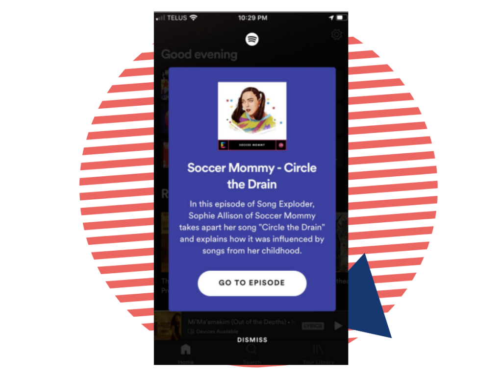
Generate pop-ups and banners at the right time at the right place, preferably with CTA buttons. These messages are great to inform users about new features or trigger users to a determinate action, for example. Spotify is a great example in this topic, once they have a personalized in-app messaging strategy well defined.
Push-notifications:
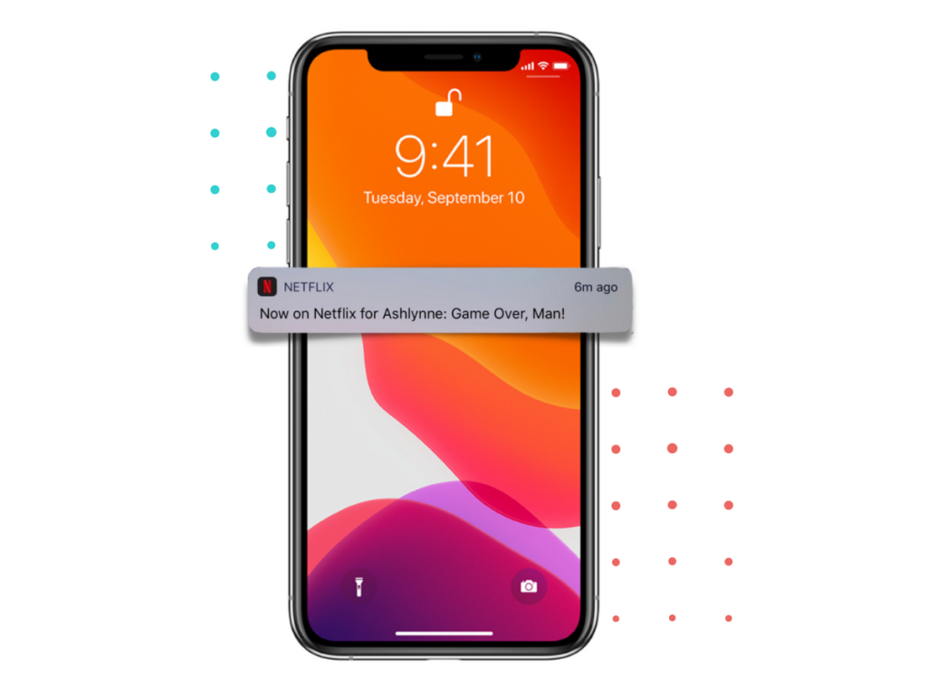
Create personalized notifications outside the app to pull users to the app and develop an action. Netflix is an excellent example of nailing it.
Tooltips:
Integrate interrogation icons in pages/elements users might need extra information. Tooltips with animation (pulsing, for example) are also a great way to bring user attention to a new feature.
Camila Leal presented a really nice perspective about mobile engaging users. She said that we need to make a good selection about what we are going to offer to our users: “We have lots of information on our smartphones. Users don’t want to keep their attention on something that isn’t important. Based on that, nothing that doesn’t generate value should be in the user journey“.
To finish, Alan said that it’s essential to A/B test every engagement action inside a mobile app to metrify the results. Finally, Vinícius noted that in-app messaging has a great potential to engage users but, nowadays, they are not well used once they are used most for marketing actions.
Support
Talking about support divided opinions. But the crucial moment before arriving at the support step is avoiding letting users get a lack of knowledge inside your app. And the best way to do this, again, is to analyze data.
When you understand where users find issues in your app, you can create strategies to avoid them. For example, Camila Leal shared her experience that 80% of problems happen in the signing-up moment. Based on that, predicting which problems users will find out allows you to help them at that moment, avoiding support questions through tooltips with the information needed, for example.
Further, when users really need support about specific questions, we found 3 prominent opinions about the best way to help them:
In-app Chat:
Chat divided opinions. Some specialists pointed out this as a good practice, and others said users don’t like to have chats in mobile apps. Those who use chats pointed out that excellent practice is starting the conversation through an automated bot to briefly collect the primary data and then discuss with an actual human. It’s essential to let users know that the customer service will be done by a human, and the bot is just a step once users don’t really like to speak with robots.
Whatsapp:
For those who don’t like or don’t want to invest in in-app chats, adding a button to a WhatsApp chat may be the best way to help users in real-time (or using another live chat platform, for countries in which Whatsapp is not used that much)
In-app FAQs:
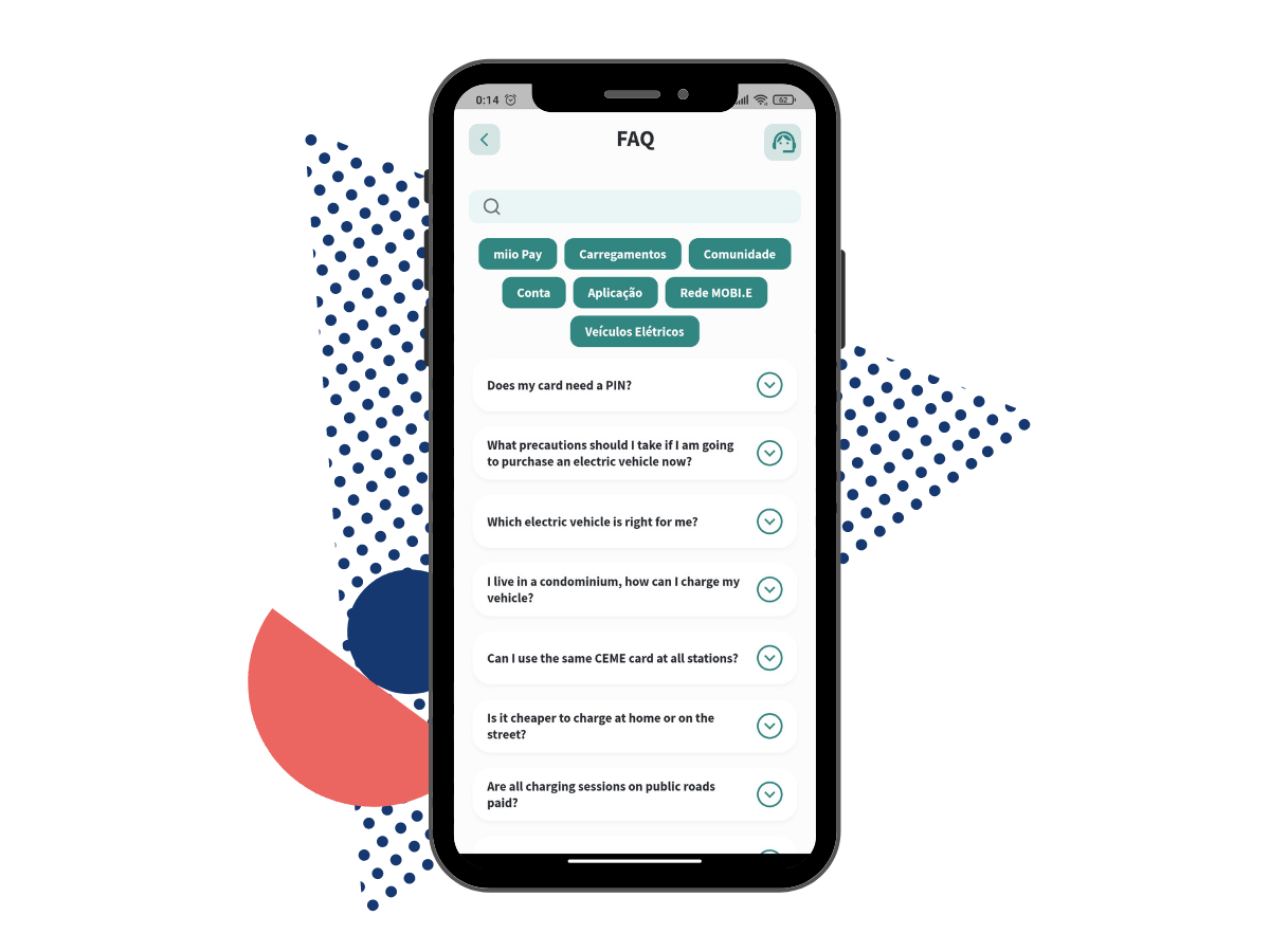
FAQs were so far the most pointed practice. Creating an in-app help center with an article directory can be the best way to help users without contacting a support team. Identifying areas where users find most trouble and adding specific buttons to these FAQs were also mentioned to have the best practice. To finalize, an issue found when talking about in-app FAQs was adding new articles to the help center. Usually, the person who makes this upload is a no-code person and might have issues during this process. Bellow, we have the example of in-app FAQ at Miio App:
Feedback
The last step when talking about the best mobile engagement practices (and not only in mobile, actually) is to gather feedback. After onboarding, engaging and supporting users, we need to know what they think about our products and services to constantly improve them.
Unfortunately (or is it an opportunity? 🤔), many mobile companies don’t invest money and time collecting feedbacks; they only gather feedback through app stores. Camila Leal pointed another essential question regarding the use of these feedback data. Many companies gather feedback only because it’s a good practice but don’t really analyze and use it for any improvement.
Each app must find the best way to collect data depending on its target regarding mobile feedback. So, thinking about, here we have the x leading practices pointed as the best practices to gather mobile feedback:
In-app Survey:
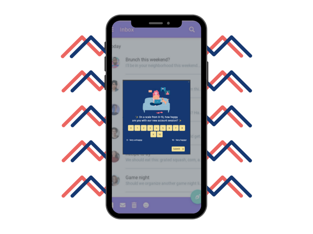
Presenting in-app push with a small survey was presented as one of the best ways to collect in-app feedback. A good example is adding questions in NPS format, for instance, with classification questions from 1 to 10. It’s brief and easy to conclude. Moreover, asking users to answer questions inside the app gets higher response rates than other methods once the user is already in the app and just needs a few clicks to conclude it.
However, it’s essential to choose the right moment to ask these questions because depending on the user experience (for example, just had a bad experience), the answer might be biased. Thinking about it, Vinícius, from Guru, explained that after many attempts, they figured out that, for their app, making a monthly NPS in the third time user get into the app in a month, at the time they get in, was the best way to collect great results.
Personal Interview:
Doing personal interviews through the phone was a great way to collect in-depth information from users and generate great insights for the app. Wildes explained that at Wabiz, they have key users that are followed more strictly, who receive interviews more often, and are an excellent thermometer for the app.
Email:
Sending surveys through email is another good practice to gather feedback once you make more questions than in-app questions. However, sending surveys through emails gets lower responses rates and might need any reward to make users respond to them.
SMS:
At least, surveys through SMS were the less pointed practice but, depending on your target, it might be a good idea to take into consideration.
To conclude
Now, more than ever, it’s time to invest in mobile engagement practices for your app. Getting users engaged, satisfied, and feeling important is the main point to finalize them, reducing the churn rates in your app.
After presenting the best practices to onboard, engage, support, and collect feedback, it’s time to test (A/B testing is always a good idea) the actions that fit better with your app and your target.
Once again, a special thanks to our interviewed specialists for giving us some fantastic insights 🙂
I hope you liked this article and could get great insights into your app. 😄
Make sure to follow Helppier on Facebook and Twitter to get into our news.


