If you thought user onboarding starts in the product, you were wrong.
Convincing users to sign up is difficult. But convincing users to come back and use your application is on a whole different level. In fact, 1 out of 4 users never return to an application after using it once!
A stunning interface will definitely help to create positive first impressions but it won’t matter if it isn’t able to capture users. And if you want to capture users, users need to understand how to use your app first and be able to extract value from it.
That’s why introducing an onboarding flow with clear instructions can come in handy.
So, what is User Onboarding?
User Onboarding is about ensuring the user understands the value you’re offering and can achieve its goals on your application. It requires some psychological research about the user’s intentions and needs, so you can guide them through the early stages of the customer journey and show them how to extract value.
Just think about it, you just signed up to a new graphic design software and you are extremely motivated to use the product. But, when you’re trying it out for the first time, you feel lost and can’t even start creating a new file. You’re probably going to try something else right?
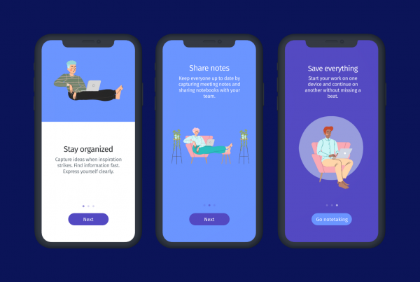
User onboarding can take many forms. It can be a personalized welcome message, a product tour that provides a short overview, a CEO video or even a popup screen. These messages help users get started on your application and increase the possibility of conversion to paying customers later on.
Which mistakes you should avoid?
Thinking onboarding starts in the product
Onboarding starts right when the user visits a landing page, fills in a form or gets a confirmation email. Make this process as clear and intuitive as possible. If users do not enjoy the initial experience they are less likely to come back.
Introducing too much information
The purpose of designing an user onboarding flow is to reduce frustration and help users take the first steps. Showing too much information or long series of steps can overwhelm users, producing the opposite effect to the intended.
Using non-standard & unclear icons
Some design elements are common in any interface, and for a great reason! Users can recognize standard icons such as the Recycle Bin or the Pencil, expecting a specific action to take place. Using unclear icons, can cause confusion and reduce engagement during the onboarding phase.
Focusing on features instead of value
Introducing all your features will not benefit users in any way. Onboarding should focus on helping users complete small but meaningful tasks that lead to mutual success. If users can achieve their goals quickly, they will see value in your app.
Not providing Guidance to the User
No matter how intuitive you think your interface is, first-time users always need guidance! Use short walkthroughs to welcome users and provide an overview, or non-intrusive tooltips to provide hints about specific features. This way you accelerate the user’s learning process.
Not celebrating user’s success
When a user completes an important task on your application, you should be there to celebrate. Use design interactions such as a high-five or a funny success message to keep users engaged and build a positive relationship.
Not Collaborating with Customer Success teams
A designer’s perspective is not always the user’s perspective. An effective onboarding experience should include marketers, product managers and customer success teams.
It’s important to gather different types of data about your users (user profiles, interests, age, engagement, location, language, devices, etc) to build the perfect flow. And who is better to share that information than the people who work together with the customer 8 hours a day?
If you want to retain users on your application, make sure you avoid these mistakes when designing an onboarding flow. A great first experience is crucial in making the user understand your product’s value and reducing frustration.
Keep in mind that the onboarding phase starts right when the user fills a registration form on your website, and that the whole experience should be flawless and intuitive. Collaborate with marketers and customer success teams to understand your audience a little bit better, and provide instructions that help the user achieve its goals.
Download free infographic
Hope you enjoyed this article! If you like reading about User Experience and Onboarding make sure to follow Helppier on Facebook & Twitter to get updated on our latest news. 📢 📄
In case you’re looking for a tool to improve onboarding on your application go ahead and check our website. 😉


