Innovation is not always the best option when it comes to UX design. Sorry.
The online world offers information in its wildest forms. Nowadays, anyone can transform an idea into a functional product or service that is used and loved by others. Opening the doors for a million color combinations, fonts, weird website designs and innovative interfaces.
And you could literally start a war over what UX design really is. Some will convince you that it is all about utility, others will tell you about emotion and user happiness… but the truth is: it is all, but combined. What you shouldn’t forget is that, in the end, it has to solve problems easily.
Some will even swap the word with User Interface, as both have the same meaning, but they don’t. UI is referred to the actual system a user interacts with. UX is about the emotions the interface evokes in the user.
You know when you’re using a website, an app, or your phone and you get frustrated when it doesn’t do what you want it to? My job is to make sure that doesn’t happen. – Invision
But with the number of websites and apps that are created each year, businesses often walk the innovation road to stay ahead of the competition, but that isn’t always the best option in terms of UX design.
Just think through it, humans are very habit-oriented. If there’s always a structured menu on top or at the bottom of a website they know that’s where the good stuff is. If there’s a magnifying glass, it’s where they should search for something. I know these might be basic examples but your users are simple creatures as well.
Good UX designers understand human emotion and user behavior patterns, because those things affect how users respond to an interface. —The Web Designer Spot
So which are the basic rules you should never ignore, when designing an innovative product?
Create a contextual design
Your users should have an idea of what’s going on. They just landed on the first screen/page and should be given a context. Your design should be contextual so users understand where they are, and where they should go next.
As a designer, your job is to determine how users will interact with your product, and show them that they are supposed to do something. You can also introduce step-by-step tutorials to lead users to specific workflows. But they shouldn’t need that all the time if they do, your UX design is not intuitive enough.
Provide easy accessibility
You know when sometimes you’re just wondering how to do something on a particular software, and then a bubble appears answering the same question you were just asking yourself? This is what your UX Design should imply.
Try providing signs or hints across your interface to trigger certain behaviors and make sure users are able to find what they need without problems. Your UX design should make sure everything you offer is easy to access and find.
Create a product that speaks to users before they even ask.
Consistency is key
Inconsistent design can confuse users really quickly, so stay away from it. Don’t try to be too creative with 6 different fonts, 7 color pallets, and 284284 icon packs.
Just imagine, when you first enter a website you instantly create an impression of that specific brand or product’s homepage, and if you saw a specific drop-down menu icon, you better find it on all pages or you will get extremely confused. The same goes for your users, and believe me, they will leave and never come back if they feel frustrated.
Focus on Onboarding
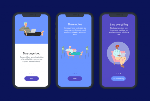
One great way to avoid frustration is by planning your onboarding wisely. If you’re designing a mobile app, for example, try using 3–4 welcoming screens that explain what your product does. If you’re designing a video game, introduce a tutorial so the player can learn the basics. If you’re designing a complex software introduce tooltips that explain specific features or forms.
Keep in mind that the more innovative you want to be, the more guidance your users will need to have a better experience. User Onboarding is not just a trendy word, it’s crucial for today’s digital transformation.
Be goal-driven
Design is built to solve problems, so whatever your client’s goals are, you should find a solution that leads users to that action, and not just something pretty to look at. The more focused your UX design is, the quicker users reach their goals.
Imagine you’re designing an e-commerce website, your client’s goals is probably to lead users to buy a new collection, find a way to highlight those first. UX design should make things simpler, not harder. So keep your client’s goals in consideration when making decisions.
Identify behavior patterns & triggers
If you want to build a great UX Design, you need to understand some psychology. You should learn about behavior tendencies, understand how user motivation changes throughout the day and what leads users to specific actions. Why? Because you want to trigger new behaviors that might lead to conversions.
With so many analytics tools out there, there is no excuse for you to ignore this rule. First, define what you expect to get from your research and make sure you’re getting valuable insights. Focus on how, rather than who. How did these 100 users sign up for a premium account? How did they manage to get there? Pay attention to patterns.
According to Snyxius, your UX design should impact these 5 layers:
Discoverability: Can your first-time users discover how to use your product?
Learnability: Can users predict how to move from one step to another?
Efficiency: Can users repeat tasks quickly and more efficiently next time?
System Performance: Is your interface slow?
Delight: Does your product convey happiness to users?
If you master these aspects, you’re definitely on your way to a successful UX design.
To sum up, if you want to create a powerful user experience for your product, you need to provide a certain balance between standardization and innovation, following these simple rules and mastering these 5 layers.
Remember, there’s a fine line between innovation and confusion, and you definitely don’t want frustrated users, they are worth more than you think.
Also, don’t forget to visit us at helppier.com if you want to improve your user experience as quick as possible.


