The first visit is where you get more attention from users. Make it count.
First-time users are incredibly valuable. They just searched on Google for a service like yours and “surprisingly” your website/software stood out. This is a huge opportunity for you to convince them that this is what they are looking for and that they should sign up because you’re awesome. And they need you.
The “aha moment” plays a very important role at this stage. Because if a user doesn’t get it, he won’t use it and will just move on to a competitor’s page. And you definitely don’t want that. Because they will recommend that service to friends and co-workers instead, and you will end up lonely and insecure.
What is it?
The “aha moment” is basically what separates users who retain from those who don’t. These users follow completely different paths on your website/software and take different actions.
How to Find it?
If you can afford to hire a data analyst, this will be incredibly easy. If you don’t, be like these guys and use a software like Mixpanel to measure user behavior on your website. And do it by yourself, no excuses.
Keep in mind that to find your “aha moment” you will need to have a few users who really love your product and use it frequently. Try to recognize at least 10 with this profile if you’re a small company.
Mixpanel has a bunch of analytics tools that not only allow you to identify who these users are but also monitor their experience on your website. According to David Arnoux from Twoodo, these are the main steps you should take:
1. Identify the users
Use a simple filtering query to find out who your power users are. For example, users that signed up last month and have already made a certain number of posts.
2. Analyze the user’s first journey
Mixpanel and Kissmetrics allow the perception of these events clearly. Check the intensity of usage of an active user’s first day and recognize a pattern.
3. Recreate the journeys step-by-step
Extract the most important steps and organize them on an Excel sheet so you have a better perception of your aha moment.
4. Run it on visitors who didn’t get the Aha Moment
Search for users who signed up or used your software for a few days but didn’t come back anymore, and compare with your power users.
5. Spot the difference
Now you probably have a precise picture of the events that had been taken by active users and left out by non-active users.
What to do next?
After you find a possible “Aha moment” you should apply onboarding strategies that can lead users to each one of these journeys. And, of course, run a/b testing to understand how they affect user retention.
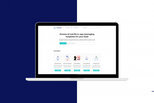
Onboarding softwares like Helppier, for example, might be useful as it’s integrated with analytics tools such as Mixpanel and Google Analytics. Furthermore, it allows creating interactive on-page user guides quickly, without coding.
After you find your ideal user journey you can use a tool like Helppier to lead users to that specific tour. A few examples could be to:
Add tooltips to particular areas of your website

Tooltips are small hover popup windows that display a brief description of a specific element (image, button, form field, text). Use tooltips to provide hints, suggestions and help messages across your website, and give opportune and relevant information to users on specific areas.
Set personalized welcome messages for when users sign in

Build personalized messages for different types of users (first-time users, active users, admin, male/female, etc) and create a workflow that is suitable for each one of them. You can, for example, set messages that start as soon as users visit a specific page, or when they are about to leave your website.
Create a step-by-step tutorial for that specific workflow

The most effective way to guide users to a workflow is through interactive step-by-step tutorials. Highlight specific elements with these guides, and lead users to the right path. Create tutorials that interact with users’ actions, by checking when they click on a button, hover a page section or open a new link.
Other great examples of Onboarding Flows

According to Josh Elman, if Twitter couldn’t get a user to follow 30 other people, they were unlikely to ever come back and use the platform. What did they do? If you check their mobile app you can see that their onboarding flow drives users exactly to follow their friends and other popular figures as soon as they register.
Dropbox
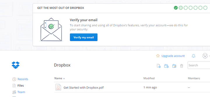

Chenli Wang realized that Dropbox users needed to put at least one file in a Dropbox folder to continue using the software. What did they do? Once users create an account they present a walkthrough bar to guide users to the process of verification and document uploading.
Basecamp
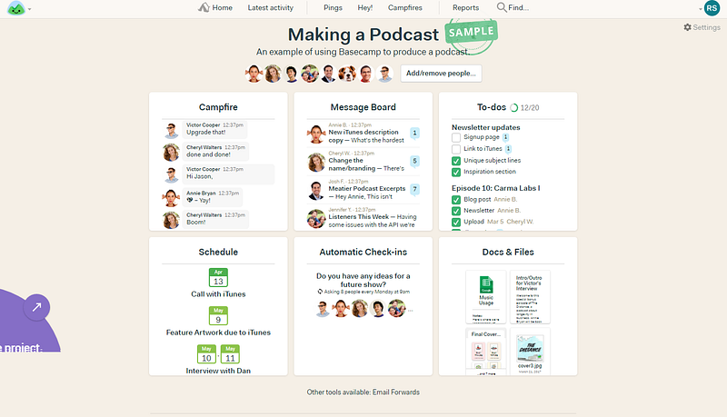
Basecamp immediately eliminates any confusion with a smooth onboarding process that screams “Hey! This is what can be done with Basecamp”. After the signup page and a few questions to set up a profile, users can see templates for sample projects, which include demos of to-do lists, message boards and a hub for files.
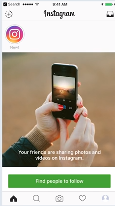

Instagram is so popular that you barely even need any onboarding. They use their core value to their advantage by using visual content like photographs and Insta Stories to onboard first-time users. And just like Twitter, after signing up, a user is immediately convinced to follow their friends and connect with Facebook or even their Contacts list.
To sum up, identify your “aha moment” from users that really love your product and use it often. Use analytics tools like Mixpanel to identify the user’s journeys and recreate them step-by-step.
Then, make a/b experiments to find out if they really affect user retention. Last but not least, create an onboarding process that leads users to that moment quickly, with on-page walkthroughs and personalized UX like big players such as Twitter and Dropbox.
Hope you enjoyed this article, and don’t forget to pay us a visit at helppier.com if you want to make this come true.


